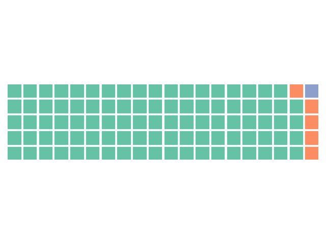
Excel can creat the Waffle Charts, Python also can do it.
but you have to the EXCEL 365, it would be easy, LOL. MS, Dman it.
you can refer to Sort, SEQUENCE Function.
https://support.microsoft.com/zh-cn/office/sort-%E5%87%BD%E6%95%B0-22f63bd0-ccc8-492f-953d-c20e8e44b86c
Python makes it easy. In the pycharm, copy this a Code:
import pandas as pd
import matplotlib.pyplot as plt
from pywaffle import Waffle

df = pd.DataFrame({
    'crime_type': ['felony', 'misdemeanor', 'violation'],
    'number_of_cases': [94, 5, 1]
})


fig = plt.figure(
    FigureClass=Waffle,
    rows=5,
    values=df.number_of_cases,
    #figsize=(10, 150)
)

plt.show()
that works!!

Refer:
- https://jonathansoma.com/lede/foundations-2018/matplotlib/creating-waffle-charts-in-pandas/
- https://www.dummies.com/article/technology/software/microsoft-products/excel/how-to-make-a-waffle-chart-for-your-excel-dashboards-138401
- https://simplexct.com/how-to-create-a-waffle-fourfold-chart-in-excel
- https://simplexct.com/charts-in-excel